Dear Moderator,

Hello and welcome to my blog.
You will find the beginning of my research and planning started in September.
My finished magazine is the last post on my blog at the top of the page.
You will also find my evaluation started in March.
I hope you enjoy reading through my blog as a lot of effort went into it, and I hope you find it interesting.
Thank you and enjoy.

Friday, 30 September 2011

Research and Planning: Music magazine collage

The notes on the collage talk about; The colours on the magazine and how they are mostly black and red, which shows they are unisex and are associated with indie/rock music. 
The fonts in most music magazine of this genre are mostly capital and bold making them look loud, representing the type of music they are showing.
Most of the poses in the pictures of the artists are neutral showing that they are about the music, not the image that  most pop artists are about.

Thursday, 29 September 2011

Research and Planning: Practice Fonts.

Research and Planning: Camera Shots


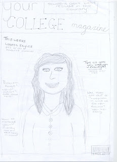
Research and Planning: College Magazine Analysis.

In my college magazine, I feel that the font sizes are appropriate as on the front cover the mast head is much bigger than the sell line fonts. The masthead is bolder that the others, although there is a sell line informing about competitions which stands out to attract the reader. On the contents page, the title is much bigger so the reader knows what the page is about. The fonts for the text telling the reader about the stories is smaller, but still big enough to read and stand out to catch the readers attention for certain stories so they can find what they want to read.


I followed the three colour rule when design the cover and contents page as i used pink and black with a little bit of white on the cover. The contents page has a white background with pink and black writing, these were also colours that i found out the target audience would like.

You can tell that the contents and cover are from the same magazine because they use the same font and colour for the headings and the rest of the text uses the same font and colour, so they look similar so look like they are from the same magazine.

I think the photographs are quite well taken as they are not stretched or distorted. The photo on the front cover fills the page without being stretched and is appropriate as the people in it are students from the college. The pictures on the contents are appropriate as they are pictures from around the college and relate to the articles. If the photo's were stretched, this wouldn't have a very good effect on the reader as it would look carelessly designed and unprofessional, so if the photo's are still in proportion and fit in with the design and subject of the magazine, this would look more attractive.

There are enough stories included on the cover as there are not too many, this would make the reader look into the magazine to find out more stories. On the contents page, i have used enough stories to fill 17 pages which would be enough to fill a college magazine. I think the stories are appropriate as they involve stories about students and information on college and events happening around them. By using interesting stories, this would make the reader want to look further into the magazine and find out what they are about. By using competitions on the cover, this makes the reader more interested as students will benefit from winning things as they are not always doing well financially.

Research and Planning: College Magazine Photos


Research and Planning: Completed College Magazine.

Friday, 16 September 2011

Research and Planning: Audience Research


What are you willing to pay for a college magazine?   £1
What colours would attract you to the magazine?     Purple
What articles would interest you most?    Sport, Hair and Beauty
Whats parts of college life do you enjoy the most?   Social life
Would you appreciate competitions within the magazine that may have prizes?  Yes
What kind of people would you like to see on the cover? Teachers, students or celebs? Students

What are you willing to pay for a college magazine?  £1
What colours would attract you to the magazine?  Red and Black
What articles would interest you most?    Sport, Health and Fitness
Whats parts of college life do you enjoy the most?   Social life
Would you appreciate competitions within the magazine that may have prizes?   Yes
What kind of people would you like to see on the cover?   Students


What are you willing to pay for a college magazine?   I wouldn't pay
What colours would attract you to the magazine?   Red/ Bright colours
What articles would interest you most?   Sports/Gaming
Whats parts of college life do you enjoy the most?   Free Time
Would you appreciate competitions within the magazine that may have prizes?   Yes
What kind of people would you like to see on the cover?  People that are relevant- students

 What are you willing to pay for a college magazine?  £1/£5
What colours would attract you to the magazine?  Pink and black and orange
What articles would interest you most?  Performing arts, media, sports, theatre
Whats parts of college life do you enjoy the most?  Social
Would you appreciate competitions within the magazine that may have prizes?  Yes, winner on the front cover
What kind of people would you like to see on the cover?  Teachers, celebs if they came into college, students.

The target audience for my college magazine will be 16-18 year old attending Hyde Clarendon 6th form college and will be both genders studying A-levels and vocational subjects.

Thursday, 15 September 2011

Research and Planning: Medium Close Up Examples

These are examples of medium close up shots.

Research and Planning: College Magazine Analysis.

This is a college magazine, you can see this by the title being 'COLLEGE'. There are also codes and conventions on the magazine that includes clues that the magazine is for a college. The cover is brightly coloured with the bright red masthead and bright picture, with darer colours on to stand out. The sell lines are about stories that would relate to teens who are in college, such as 'She's 15 and pregnant' and the words 'SMU's Campus' which is probably the college that the magazine is for. Also, some of the text is bold to grab the readers attention, which is why interesting stories are used, making the reader want to buy the magzaine and read into it.
The clothes that the girl in the picture is wearing suggest that she is a student as it shows she is young and her t shirt says 'I heart SMU' showing that she attends that college. The colour of the masthead is the same colour as the girls shirt which is vibrant and keeps the style of colours consistant, making the magazine look more attractive. The bar code is placed without intruding the picture or the text on the cover and blends in as the side has a blur strip which matches the colour of some of the text.
The girl is the main subject of the shot, and as she is attractive this makes the magazine more attractive meaning that the magazine will attract more attention, especially male attention. The colours also contrast with each other, using red and blue makes the text stand out more.

Research and Planning: Introduction to InDesign

Monday, 12 September 2011

Research and Planning: Photoshop Challenge

I used the text tool and edited the colour, font and size of the text and put drop shadow on it, changed the colour of the back ground using the paint bucket tool, put a border on around the image and used stroke on it,  and changed the hair colour of the person.

Research and Planning: Film Poster

This is not a very good attempt at photoshop. I used the marquee tool to cut around my face and edit onto the photo. I changed the colour of my skin to make it darker and i used the rubber to make the shape of my face fit onto the photo.

Friday, 9 September 2011

Research and Planning: Skin Tutorial


I used to the spot healing brush tool to cover blemishes on the face. I had to alter the size of the brush to the correct size.
I opened another layer and used the smart blur to make the skin look better.
I used the brush tool to do her makeup; eyeshadow, blusher, lips and eyelashes and added highlights to her hair.

Thursday, 8 September 2011

Research and Planning: Introduction to Photoshop

This is my first attempt at photo shop. I learnt how to;
cut out an image
use the magic wand
the colour adjuster
rotate and re size an image