Dear Moderator,
Hello and welcome to my blog.
You will find the beginning of my research and planning started in September.
My finished magazine is the last post on my blog at the top of the page.
You will also find my evaluation started in March.
I hope you enjoy reading through my blog as a lot of effort went into it, and I hope you find it interesting.
Thank you and enjoy.
Thursday, 22 December 2011
Research and Planning: Front Cover Layout Idea.
I like the long shot on the front cover and would like to use a long shot on my magazine. There are not too many stories clogging up the space so the photo can be clearly seen which is the effect I would want on my front cover.
Wednesday, 21 December 2011
Research and Planning: Contents Page Layout Ideas.
I like how the main photo is put to the side so the text can fit around it. I also think the stories under different categories and headings look good and separate the contents page, they also make it look divided and fill the space well.
Monday, 19 December 2011
Research and Planning: Double Page Spread Layout Idea.
My plan is to use a long shot on one side of the page and put the text on the other side as I think this looks effective and uses the space well and there is not white space in this example.
Thursday, 15 December 2011
Research and Planning: Trouble With My Photos.
These were the two possible photos that I was going to use for my front cover, as they looked clear on the camera and are long shots which is what I want to use. Although when I uploaded them to the computer, they looked too blurry to use so wouldn't be effective on my magazine. This means that i will have to do another photo shoot to get a photo of better focus to use on the cover of my magazine.
Friday, 9 December 2011
Thursday, 8 December 2011
Tuesday, 6 December 2011
Research and Planning: Make-up Test Shots.
By using dark make-up, the style looks more indie/rock and makes the eyes stand out more.
Using red/dark lipstick makes the make-up look brighter and more noticeable.
This lipstick will add to nude coloured make-up, and could be put with dark eye make-up.
This make-up looks quite natural, although there is make-up on, there is not so much so the eye looks too dark.
Using red/dark lipstick makes the make-up look brighter and more noticeable.
This lipstick will add to nude coloured make-up, and could be put with dark eye make-up.
This make-up looks quite natural, although there is make-up on, there is not so much so the eye looks too dark.
Sunday, 4 December 2011
Research and Planning: My Band Name.
As this doll has quite noticeable make up on and is quite unusual, I thought the name 'The Pot Dolls' would be an appropriate name to use for the band I will use in my magazine. I would like my models to look like this, with their make up being noticeable and giving them a unique look.
Friday, 2 December 2011
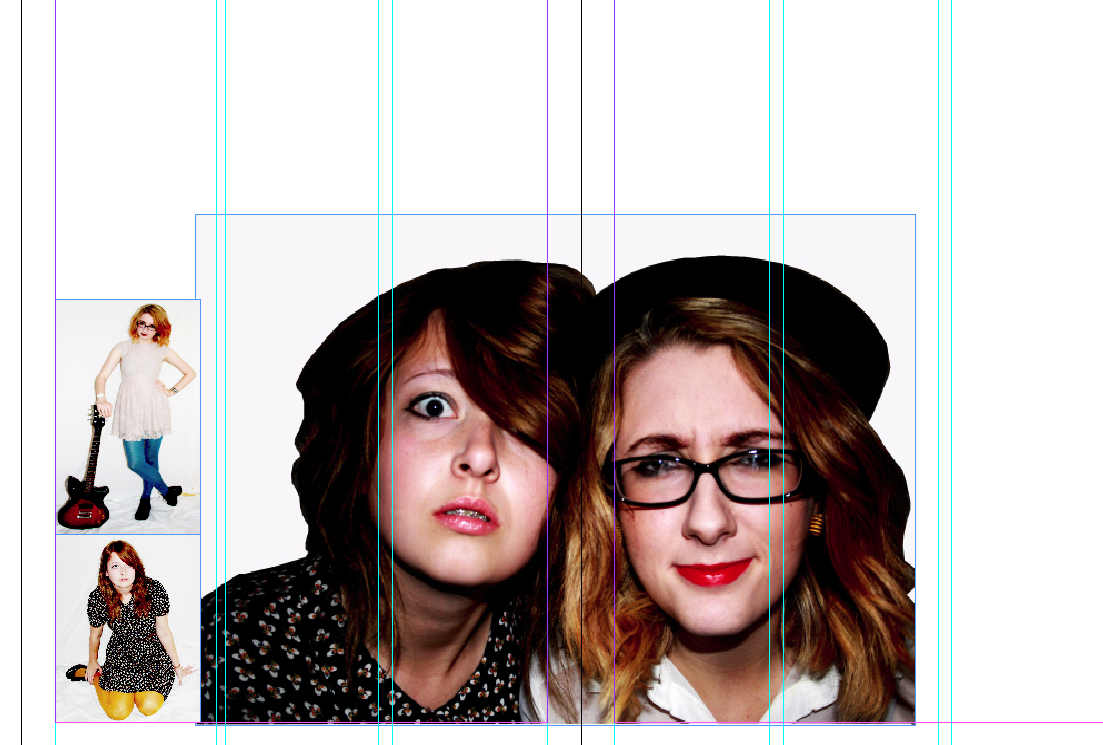
Research and Planning: Double Page Spread Layout.
Originally, I planned to set my double page spread out by putting a long shot photo on one side of the page with the text on the other side, but when I looked at the photos I have taken, it turns out that the best quality photo and the most effective is a close up on both of my models faces. This means that if I put this picture on one side of the page, their faces would be stretched and distorted, therefore, I am going to put the photo in the middle, going across both pages, and position the text around it so all of the space is used.
Thursday, 1 December 2011
Subscribe to:
Posts (Atom)